
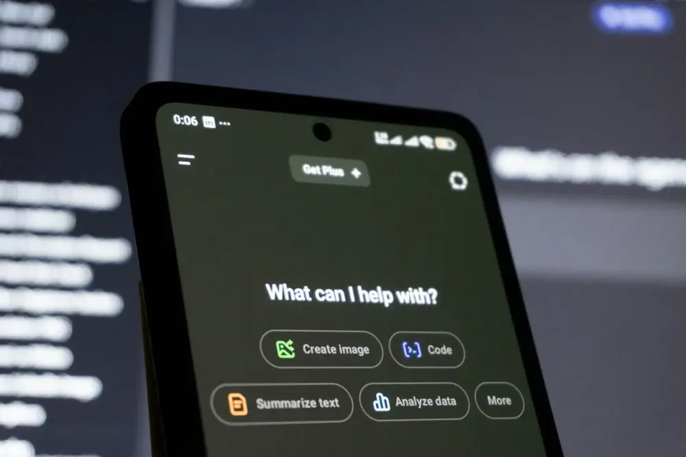
Mobile interface clarity and accessibility refers to the practice of designing mobile websites and applications so they are easy to perceive, understand, and operate for all users, including those with disabilities. It involves using clear navigation, high-contrast visuals, and screen-reader-friendly structures to ensure digital content is usable regardless of a user’s physical or situational limitations.
Mobile visitors often face environmental friction like screen glare or the constraints of one-handed use. To improve clarity, designers must ensure that visual aesthetics never obstruct a user’s ability to complete a task. By prioritizing functional layouts over decorative elements, you can reduce cognitive load and ensure a seamless path from product discovery to a finished checkout.
Core Principles of Inclusive Mobile Design
Clarity starts with visual hierarchy. A user should be able to squint at their screen and still identify which element is the primary action. This is often where minimalist design fails; by removing borders and shadows, designers sometimes remove the cues that signify a button is interactive. To avoid this, ensure that your touch targets are at least 44x44 pixels. This size accounts for the average human finger pad and prevents the frustration of accidental clicks on adjacent links.
Color contrast is another non-negotiable pillar. For text to be accessible, it generally requires a contrast ratio of at least 4.5:1 against its background. For example, light grey text on a white background might look sophisticated in a design mockup, but it becomes invisible to a user standing in direct sunlight or someone with low vision. When you make mobile buttons that people actually want to interact with, you are combining high-contrast labels with clear, defined shapes that stand out from the rest of the page content.
Structuring Main Navigation and Utility Links
Mobile navigation should prioritize the most frequent user tasks rather than mirroring the desktop site’s entire site map. A common mistake is burying essential utility links—like "Order Status" or "Store Finder"—inside a deep hamburger menu. On a mobile interface, these are often high-intent actions that deserve a spot in a persistent header or a dedicated utility bar at the bottom of the screen.
Consider the evolution of the HTC Sense interface, which prioritized quick access to communication and weather. Modern mobile web design should follow a similar logic by placing vital navigation within the "thumb zone"—the arc-shaped area a user can easily reach with their thumb while holding the phone with one hand. Moving primary navigation to the bottom of the screen can significantly reduce the physical strain of browsing and improve the overall conversion rate for multi-step processes.
Using "On This Page" Links for Better Discoverability
Long-form content on mobile can be daunting. Users often feel lost when scrolling through extensive product descriptions or long-form guides. To solve this, implement "On This Page" or jump links at the top of long articles. This allows a user to skip directly to the section they need, such as "Technical Specifications" or "Shipping Policy," without manually hunting through 2,000 words of text.
A specific example of this in practice is a technical support page for a device. Instead of making the user scroll past the warranty information and setup instructions to find the troubleshooting steps, a simple list of anchor links provides immediate utility. These links should be styled clearly as interactive elements, perhaps using a distinct color or an underline, to ensure they aren't mistaken for static headings. This practice directly supports mobile speed and friction: the guide for better user retention, as it respects the user's time and cognitive load.
Consistency Between Mobile Web and Native Apps
Users often move between a brand’s native app and its mobile website. If the iconography, terminology, or navigation patterns differ wildly between the two, it creates cognitive friction. For instance, if a retail app uses a "Shopping Bag" icon but the mobile website uses a "Cart" icon, the user has to pause and relearn the interface. This split second of confusion can be enough to disrupt a purchase flow.
Maintain consistent labeling for all buttons and links. If a primary call-to-action is labeled "Buy Now" on the app, it should remain "Buy Now" on the web, rather than switching to "Add to Basket." This consistency extends to gesture support as well. While native apps often use swipes, the mobile web is primarily a tap-and-scroll environment. Ensure that even if you implement swipe-based carousels on the web, there are clear visual indicators (like dots or arrows) for users who prefer standard tap interactions.
How to Test and Improve Mobile Accessibility
Improving accessibility is an iterative process that requires both automated tools and manual observation. You cannot rely solely on a design tool’s "accessibility plugin" to catch every issue. Follow these steps to audit your mobile interface:
- Run an automated audit: Use tools like Lighthouse or Axe to identify missing alt text, low color contrast, and improper heading structures.
- Test with a screen reader: Turn on VoiceOver (iOS) or TalkBack (Android) and attempt to navigate your site using only audio cues. If you cannot reach the checkout button, your site is not accessible.
- Check tap target spacing: Use a physical device to ensure buttons aren't placed too closely together, which leads to "fat-finger" errors.
- Simulate situational limitations: View your site on an older device with a lower-resolution screen under bright light to see if the interface remains legible.
By following these steps, you move beyond theoretical design and into the realm of practical usability. Testing on actual hardware—like an older HTC handset or a mid-range Android phone—reveals performance lags and rendering issues that high-end developer monitors will never show.
Refining Your Mobile Interface Strategy with 2MyMob Heritage Guide
Effective mobile design isn't about following the latest aesthetic trend; it is about respecting the user's physical reality and cognitive limits. By looking back at the lessons from the early mobile web, we see that the most successful campaigns were those that prioritized clarity over clutter. Whether you are optimizing a checkout flow or building a content-heavy guide, the focus should always be on reducing the effort required to take the next step.
At 2MyMob Heritage Guide, we focus on these timeless UX lessons. From the high-contrast needs of early Oroton-era mobile storefronts to the precise tap targets required by the first generation of touchscreens, the fundamentals of mobile interface clarity remain the same. Applying these heritage-informed principles ensures that your modern campaigns are accessible to everyone, everywhere, on any device.