
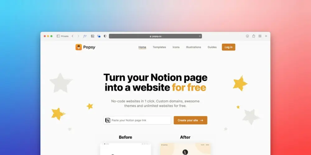
Landing page optimization is the systematic process of improving page elements—such as headlines, call-to-action buttons, and visual hierarchy—to increase the percentage of visitors who complete a specific goal. By using data-driven testing and user behavior analysis, marketers refine the user experience to reduce friction and maximize conversion rates from inbound traffic.
Successful optimization in 2026 requires moving beyond basic aesthetic changes. It involves a deep look at how users interact with mobile interfaces, drawing on lessons from the early days of mobile marketing when limited bandwidth and screen space made every element critical. Today, the focus remains on technical performance and reducing the cognitive load on the visitor.
What Landing Page Optimization Means
Landing page optimization is the practice of fine-tuning a standalone web page to ensure it meets a specific objective. Unlike a homepage, which serves as a general directory, a landing page is designed for a singular purpose: conversion. This might mean a newsletter signup, a product purchase, or a lead generation form. In the context of 2026, this means ensuring that the page responds perfectly to the specific intent of the visitor, whether they arrived via a social media ad, a search engine result, or a QR code in a physical retail space.
The process involves analyzing user behavior through tools like heatmaps and session recordings. For example, if a user on a mobile device constantly scrolls past a primary call-to-action (CTA), the optimization process identifies this friction and tests new placements. It is a continuous cycle of research, implementation, and measurement. In the early days of mobile web browsing, optimization often meant just making the page load at all. Today, it means making the page so intuitive that the user completes the goal without having to think about the interface.
Why Optimization Matters
In a competitive digital environment, the cost of acquiring traffic continues to rise. Whether you are paying for clicks on a search engine or investing in organic content, every visitor represents a financial or time-based investment. Optimization is the lever that determines the return on that investment. A page with a 2% conversion rate that is optimized to reach 4% effectively doubles the revenue of a campaign without increasing the advertising budget.
Consider a boutique e-commerce brand launching a new line of sustainable footwear. If their landing page is cluttered or slow, potential customers will bounce back to their social feeds. By optimizing the page—perhaps by streamlining the checkout process or clarifying the value proposition—the brand captures more of the existing traffic. This efficiency is vital for small independent sites that do not have the massive budgets of enterprise corporations. It is about doing more with what you already have.
How the Optimization Process Works
The optimization process follows a scientific approach. It begins with data collection. Quantitative data from platforms like Google Analytics 4 shows where users are dropping off, while qualitative data from user surveys or heatmaps explains why they might be leaving. Once a bottleneck is identified, a hypothesis is formed. For instance, "Changing the CTA button from 'Submit' to 'Get My Free Guide' will increase signups because it emphasizes the benefit rather than the effort."
Next comes testing. A/B testing is the most common method, where two versions of a page are shown to different segments of the audience to see which performs better. In 2026, multivariate testing is also common, allowing for the testing of multiple variables simultaneously. After a statistically significant amount of data is collected, the winning version is implemented. This is not a one-time event; it is a recurring workflow. Even a high-performing page can be improved as user expectations and device capabilities evolve.
Common Optimization Misconceptions
One of the most persistent myths is that optimization is just about changing button colors. While visual contrast is important, it is rarely the primary driver of conversion. True optimization addresses the psychological triggers and technical hurdles that prevent a user from taking action. Another misconception is that "more information is better." In reality, overloading a page with technical specifications can lead to analysis paralysis. The goal is to provide exactly enough information to facilitate a decision.
Many practitioners also fall into the trap of "desktop-first" design. In 2026, the vast majority of web traffic is mobile. Designing a beautiful desktop page and then shrinking it down often leads to common mobile performance mistakes and how users perceive the brand's quality. Finally, there is the belief that best practices are universal. What works for a B2B software company may fail for a local artisan bakery. Every audience has different motivations and pain points, making site-specific testing essential.
Essential Landing Page Terms
To navigate the world of conversion optimization, certain terms are fundamental. Understanding these helps in diagnosing issues and communicating strategies:
- Hero Section: The top part of the landing page that is visible without scrolling. It usually contains the headline, a subheadline, and the primary CTA.
- Conversion Rate: The percentage of visitors who complete the desired action.
- Friction: Any element on a page that makes it difficult for a user to convert, such as a long form or slow loading speeds.
- Social Proof: Evidence that others have found value in the offering, such as testimonials, reviews, or trust badges.
- Above the Fold: A carryover from newspaper days, this refers to the content visible on a screen before the user begins to scroll.
- Message Match: The degree to which the landing page content aligns with the ad or link that brought the user there.
10 Practical Optimization Tips
Implementing these ten practices in 2026 will ensure your landing pages are prepared for modern user behavior and technical standards.
1. Prioritize Time to Interactive
Users in 2026 have zero patience for lagging interfaces. It is not enough for the page to look ready; it must be functional. Ensure that scripts do not block the user's ability to click buttons or scroll. A page that looks loaded but doesn't respond to touch is a major source of frustration.
2. Optimize for the Thumb Zone
With larger mobile screens, the most accessible area for a user's thumb is the bottom and middle of the screen. Place your most important interactive elements, like the "Buy Now" or "Sign Up" buttons, within this easy-to-reach zone to make mobile buttons that people actually easy to use.
3. Use High-Contrast Visual Hierarchy
Your CTA should be the most visually prominent element on the page. Use a color that stands out from the rest of the palette. If your page is mostly blue and white, an orange or lime green button will naturally draw the eye. This guides the user's focus without requiring them to read every word.
4. Streamline Form Fields
Every additional field in a form reduces the likelihood of completion. Ask only for the essential information. If you only need an email address, don't ask for a phone number or a job title. You can always collect more data later in the customer journey.
5. Implement Contextual Social Proof
Don't just dump all your testimonials at the bottom of the page. Place a relevant quote near the specific feature it mentions. If you are discussing the ease of use of your app, place a user review about the interface right next to that section.
6. Ensure Message Match
If your ad promises a "50% Discount on Leather Bags," the landing page headline should explicitly mention that discount. If the user feels they have been misled or if they have to search for the offer, they will leave immediately.
7. Use Descriptive, Action-Oriented Headlines
Vague headlines like "Welcome to Our Site" are a waste of space. Use your headline to state exactly what the user will get. "Save 10 Hours a Week on Bookkeeping" is far more effective because it promises a specific, desirable outcome.
8. Leverage White Space
Clutter kills conversions. Use generous margins and padding to separate different sections of your page. This makes the content more readable and prevents the user from feeling overwhelmed by a wall of text or images.
9. Optimize Visual Assets
In 2026, high-resolution displays are the norm, but heavy images still slow down pages. Use modern formats like WebP or AVIF to maintain quality while keeping file sizes small. Ensure that images serve a purpose and are not just decorative filler.
10. Conduct a 5-Second Test
Show your landing page to someone for five seconds, then hide it. Ask them what the page was about and what they were supposed to do. If they can't answer, your messaging and visual hierarchy need more work. Clarity should always come before cleverness.
How this relates to Funnel & Page Element Optimization
Landing page optimization is the frontline of broader funnel and page element optimization. Every button, image, and line of microcopy is a variable that can either help or hinder a user's progress through your marketing funnel. When we look back at early mobile campaigns—the kind seen during the HTC and Oroton era—we see that the most successful strategies were those that respected the user's time and physical interaction limits. Those lessons remain the foundation of conversion work today.
By focusing on the specific elements of a page, you are essentially refining the mechanics of your entire business. A well-optimized page element is like a well-oiled gear; it allows the rest of the funnel to operate smoothly. Whether it is adjusting the padding around a button for better tap accuracy or rewriting a headline for better emotional resonance, these small changes aggregate into significant business growth. This practical, detail-oriented approach to UX and performance is what defines the 2MyMob Heritage Guide | Early Mobile Marketing & UX Lessons. By applying these heritage-informed lessons to the technology of 2026, we create digital experiences that don't just look good but perform exceptionally.